Object Study
Objective
The objective of this project was to study an object through both physical and digital drawing, using Illustrator to refine and develop our work. We explored how an object can be simplified and represented visually while maintaining its most recognizable features.
Initial Sketches
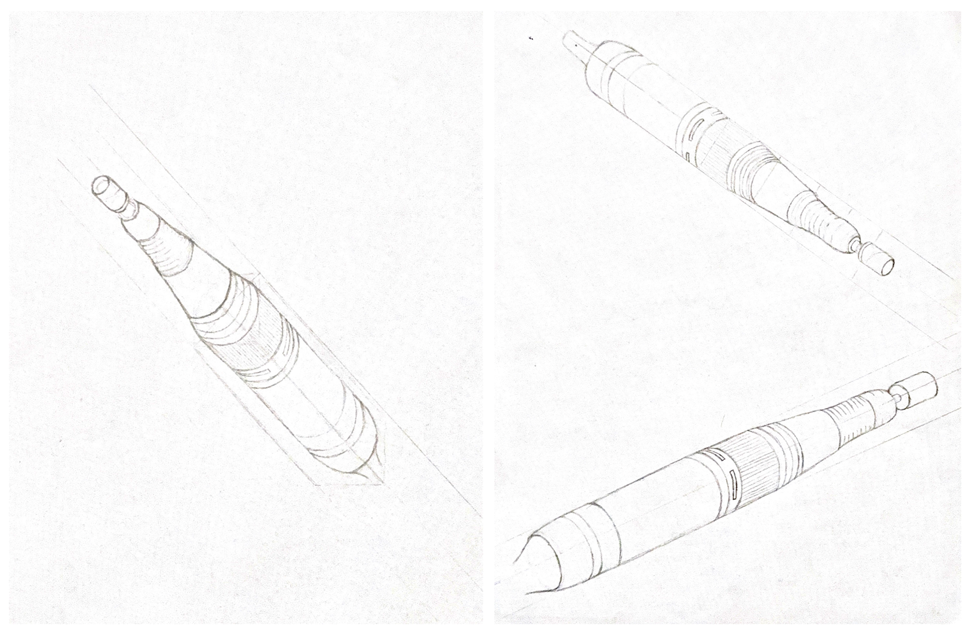
We first created basic sketches of the object from different angles to better understand its shape, proportions, and defining features. Exploring multiple views helped us determine which details were most important to capture as we continued through the project.
Object Development
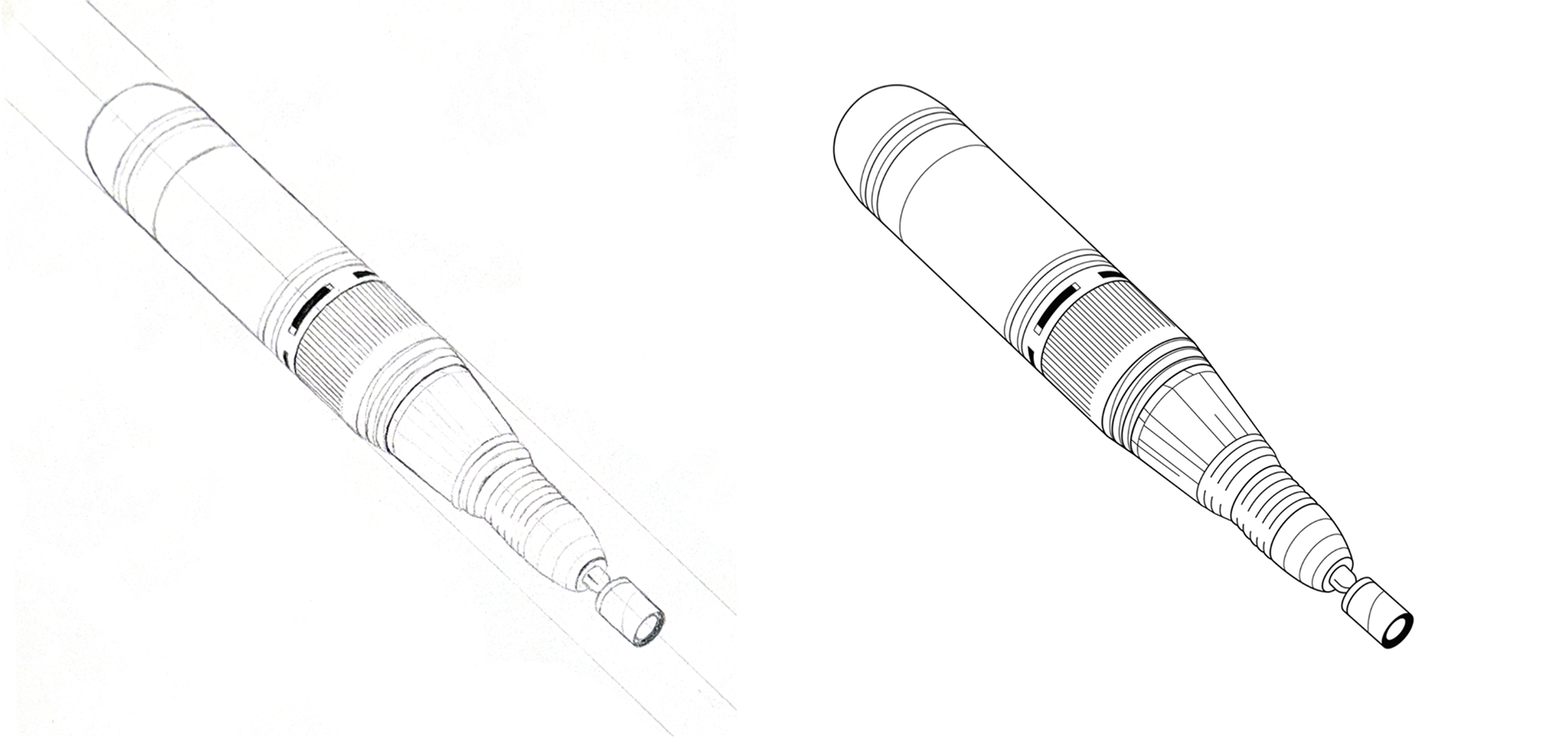
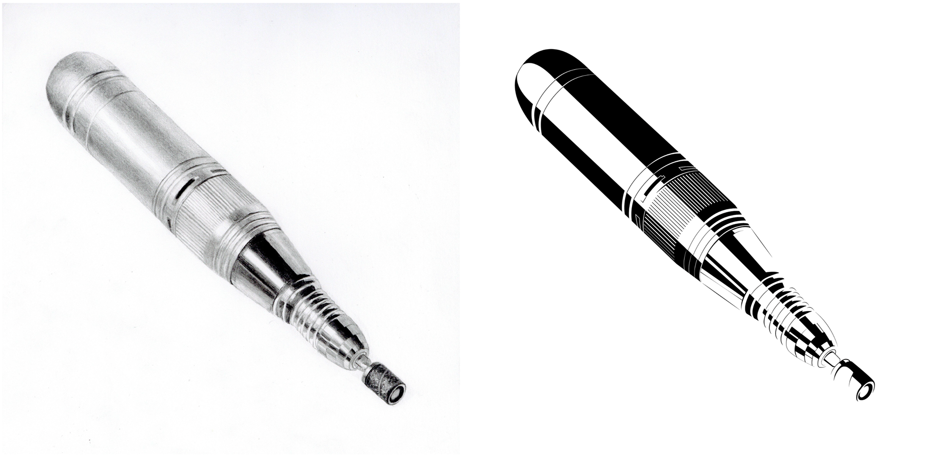
Once we established an angle, we created a simple line drawing of the object without shading. We then moved to the computer to refine the drawing, ensuring the geometry and symmetry were accurate. After completing the linework, we developed a shaded version to add depth and dimension. Finally, we translated the drawing into a polished black-and-white digital version.
Icon Creation
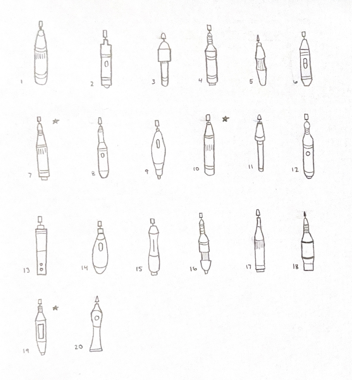
Our final step was to create a logo that represented the object as a whole while simplifying it into a recognizable form. We experimented with different ways to capture the main features of the object. I decided to incorporate a hand and fingers because they helped communicate what the object was while keeping the icon simple.
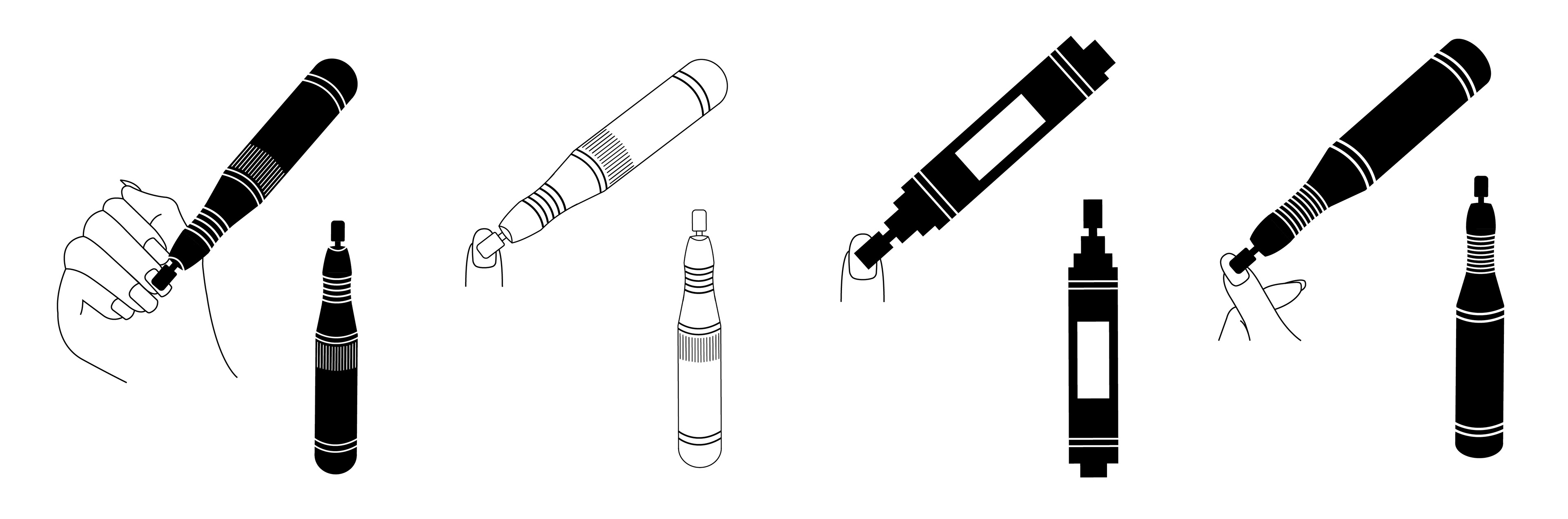
Final Icon

Brandmark
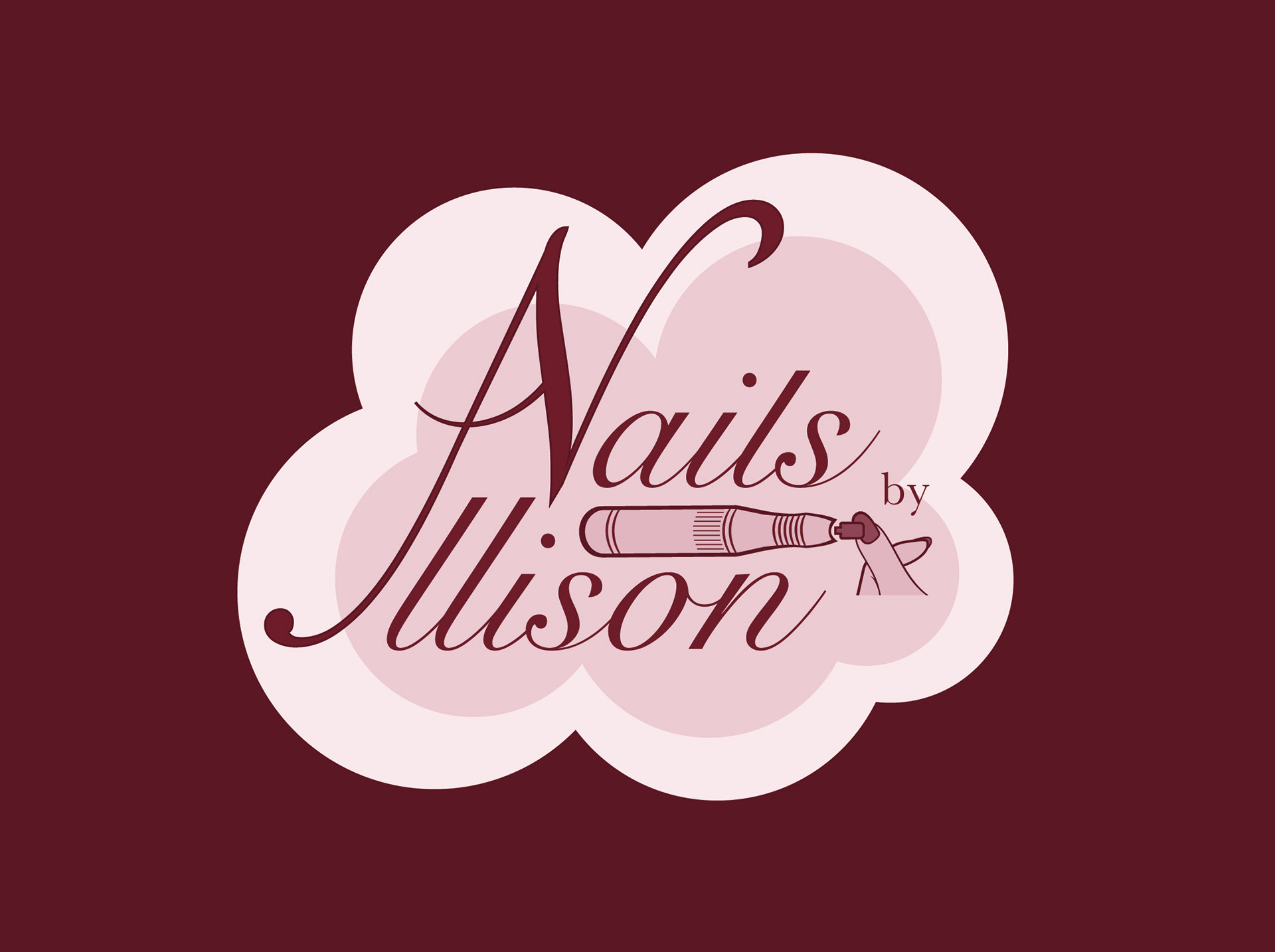
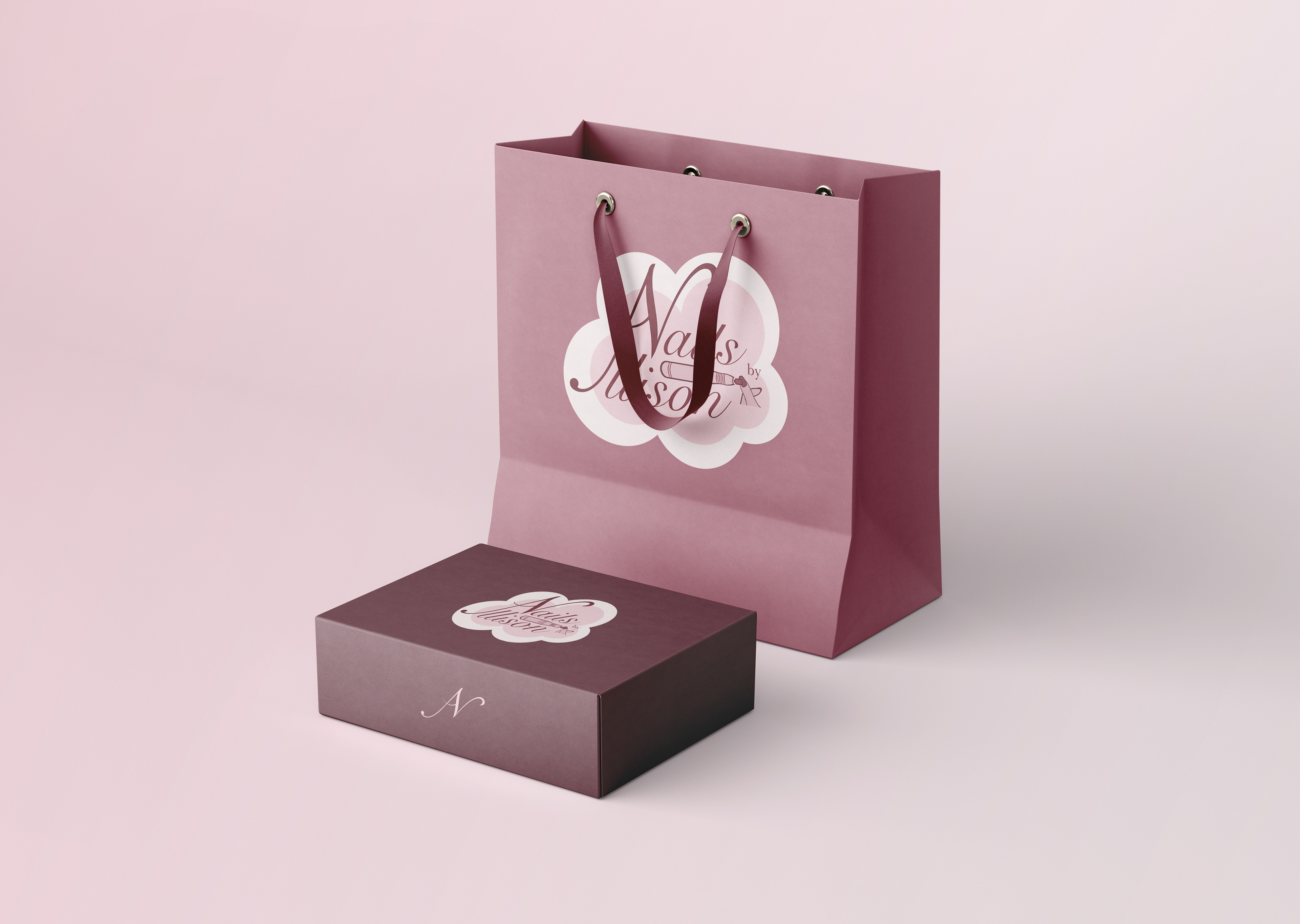
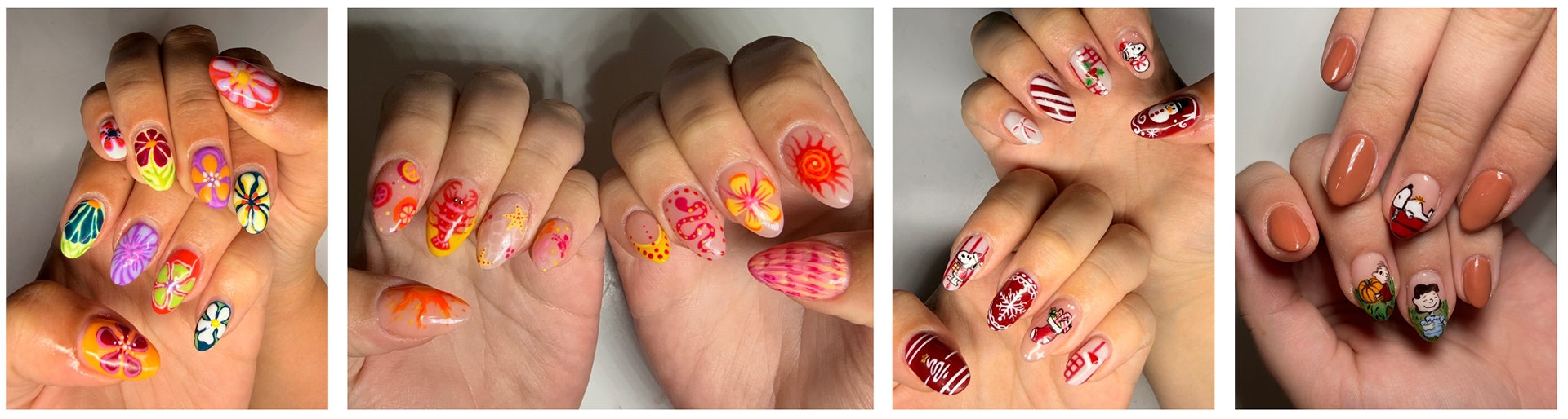
I do my own nails, as well as nails for family and friends, so I used this project as an opportunity to explore what a personal nail service could look like through the creation of a brandmark.
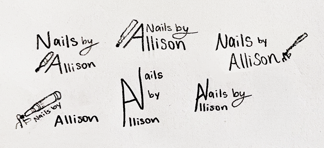
I started by sketching different layout ideas and exploring a variety of concepts, some incorporating the icon I created and others focusing solely on the type.
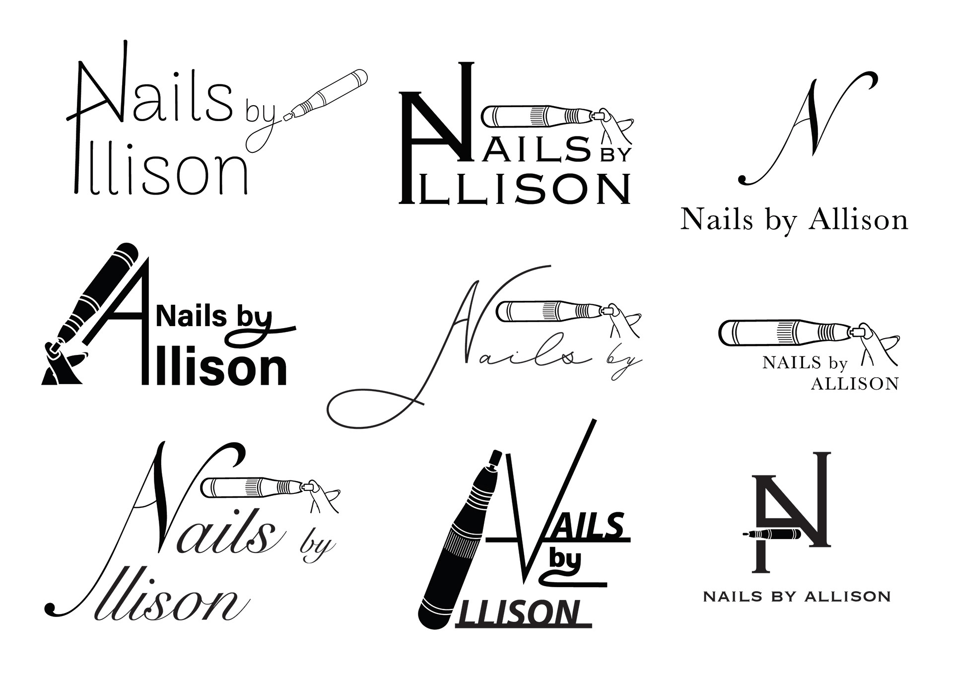
I then moved to the computer to further develop some of the concepts I liked most. I experimented with my icon by changing its orientation, including inverting it and adjusting the position of the fingers, to create variations that better fit the overall feel of that specific idea.
Color Studies
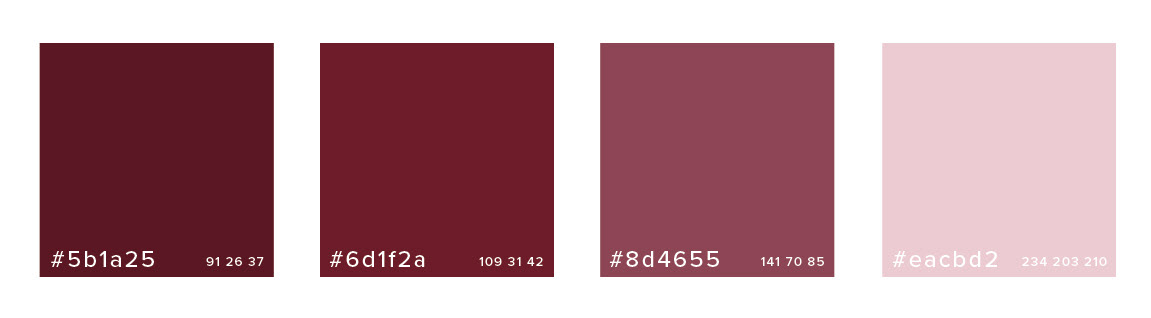
I chose burgundy as the main color because it feels bold, elegant, and sophisticated, while still fitting well within the beauty industry. I created lighter variations of the burgundy to create soft pink tones, giving the brand more variety while keeping the palette cohesive. The combination also helps the brand feel polished and inviting, which connects to the overall look and feel of the beauty industry.
Final