Objective
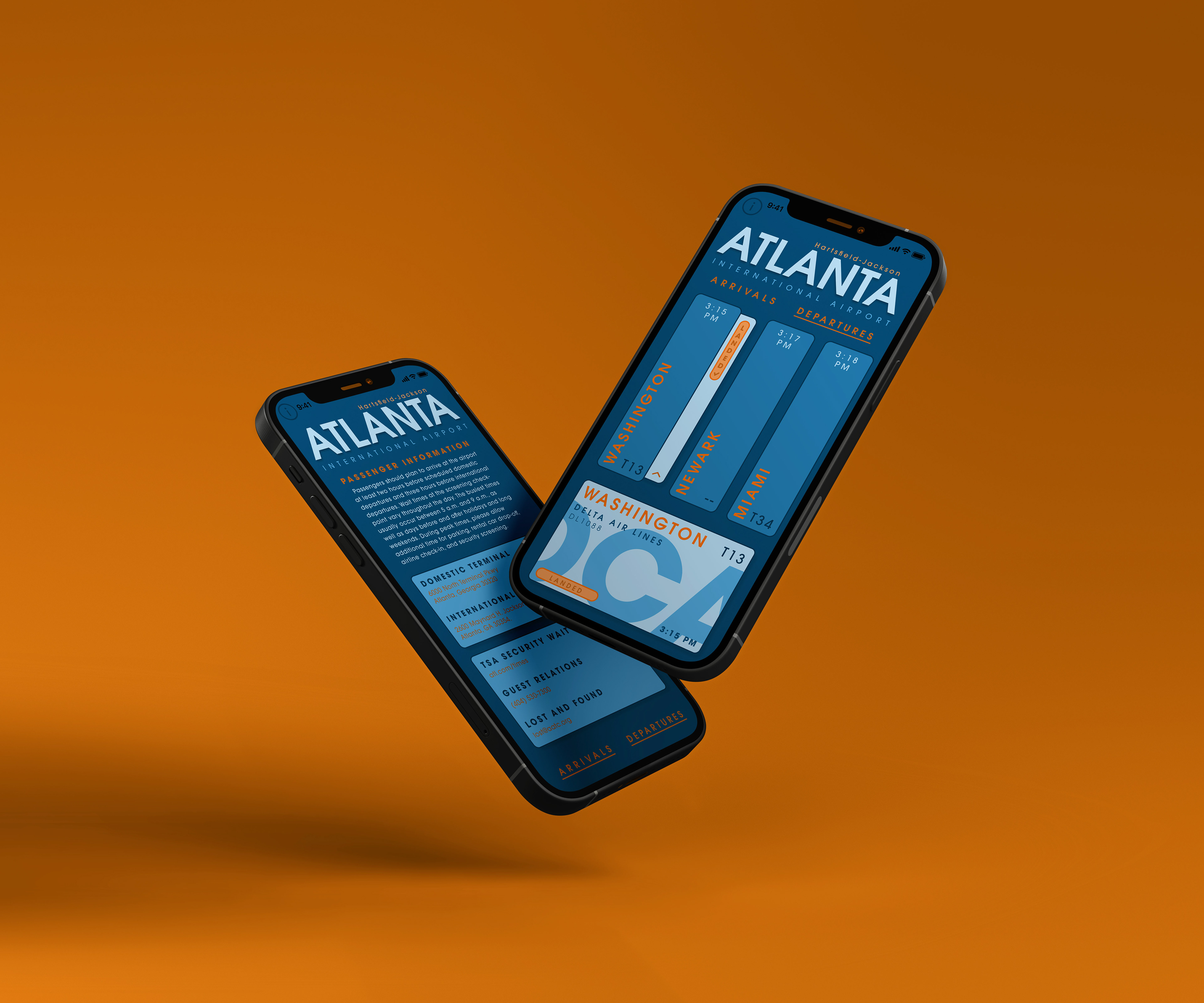
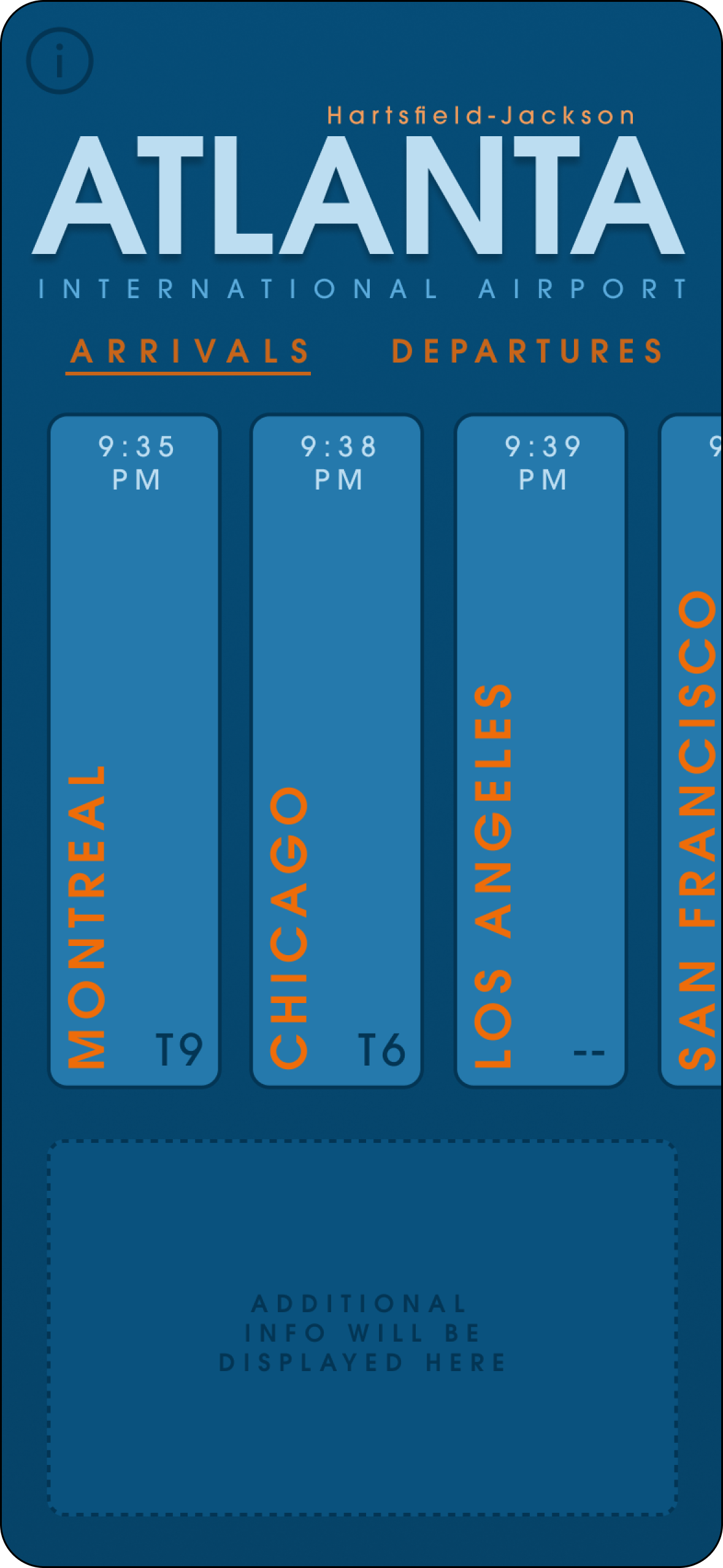
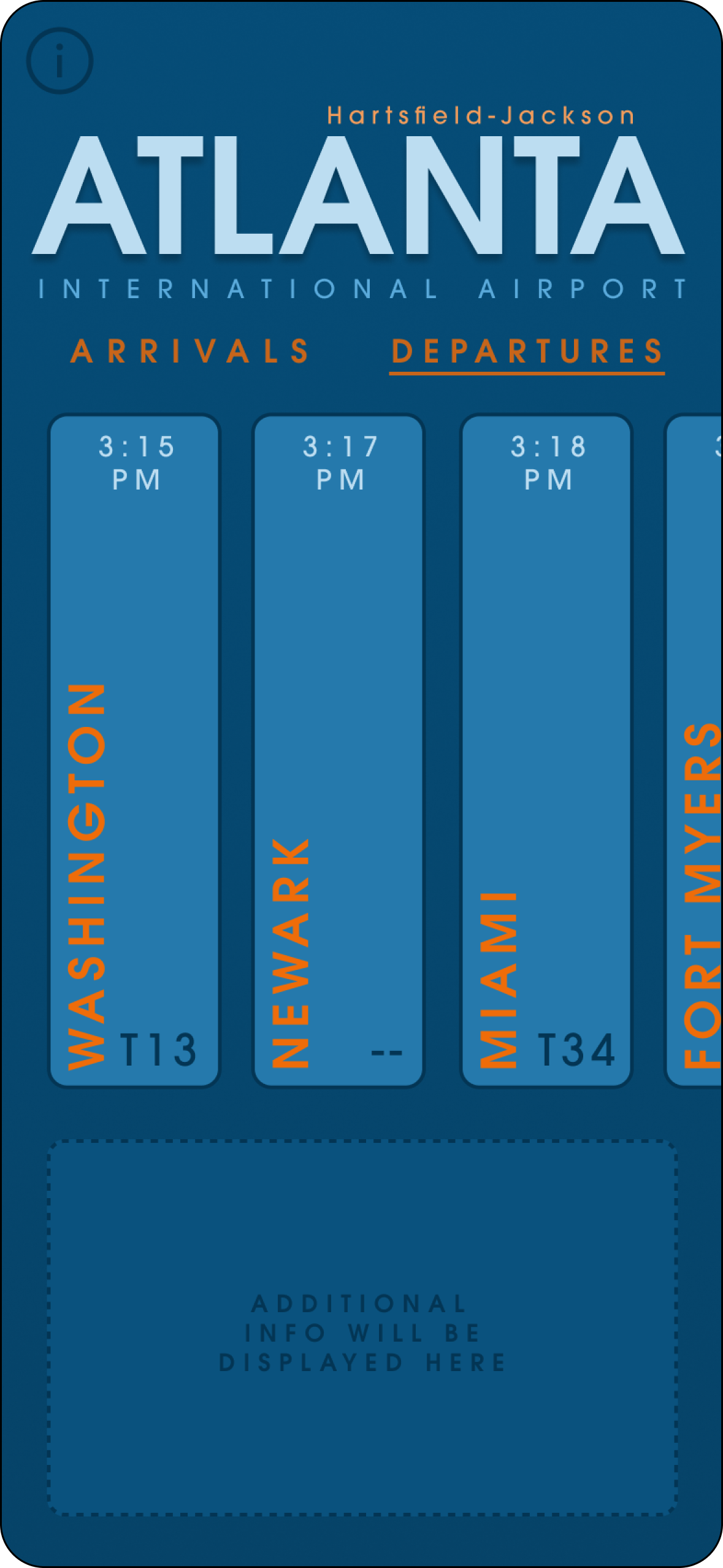
Create a FIDS (flight information display system) for mobile phones to provide real-time flight information to passengers. It should be intuitive and help make flying easier and less stressful for all travelers. Travelers should be able to get all of their information quickly and efficiently.
Initial Sketches
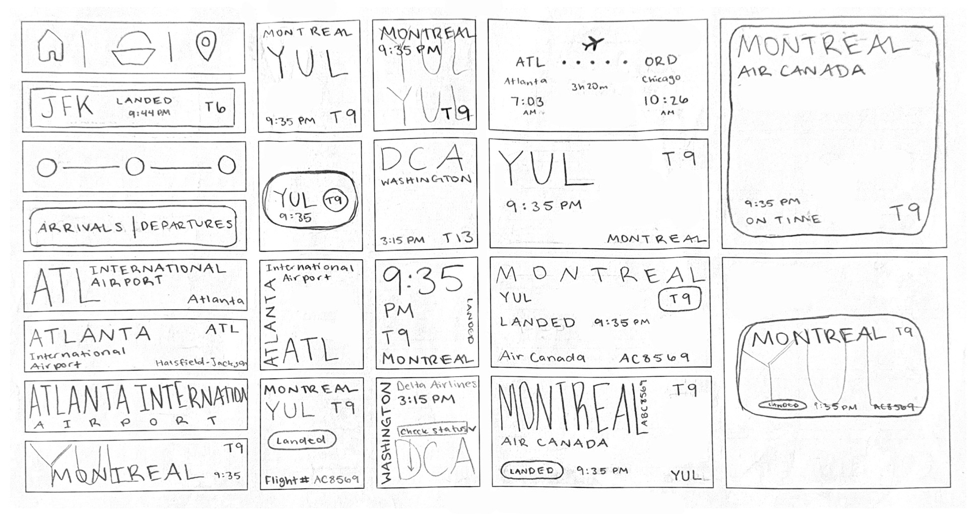
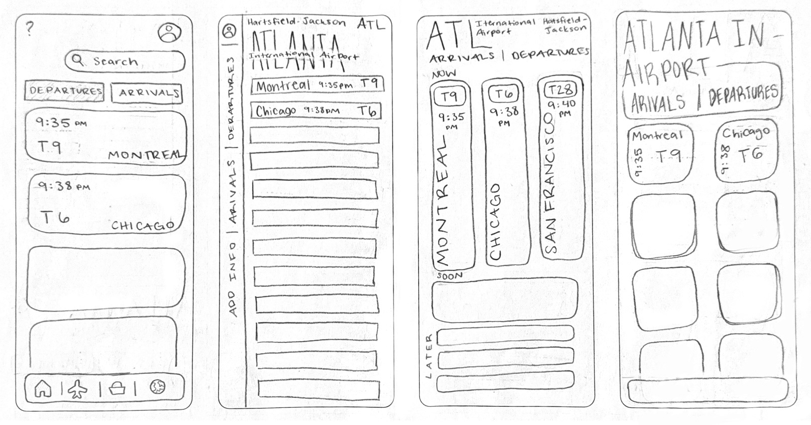
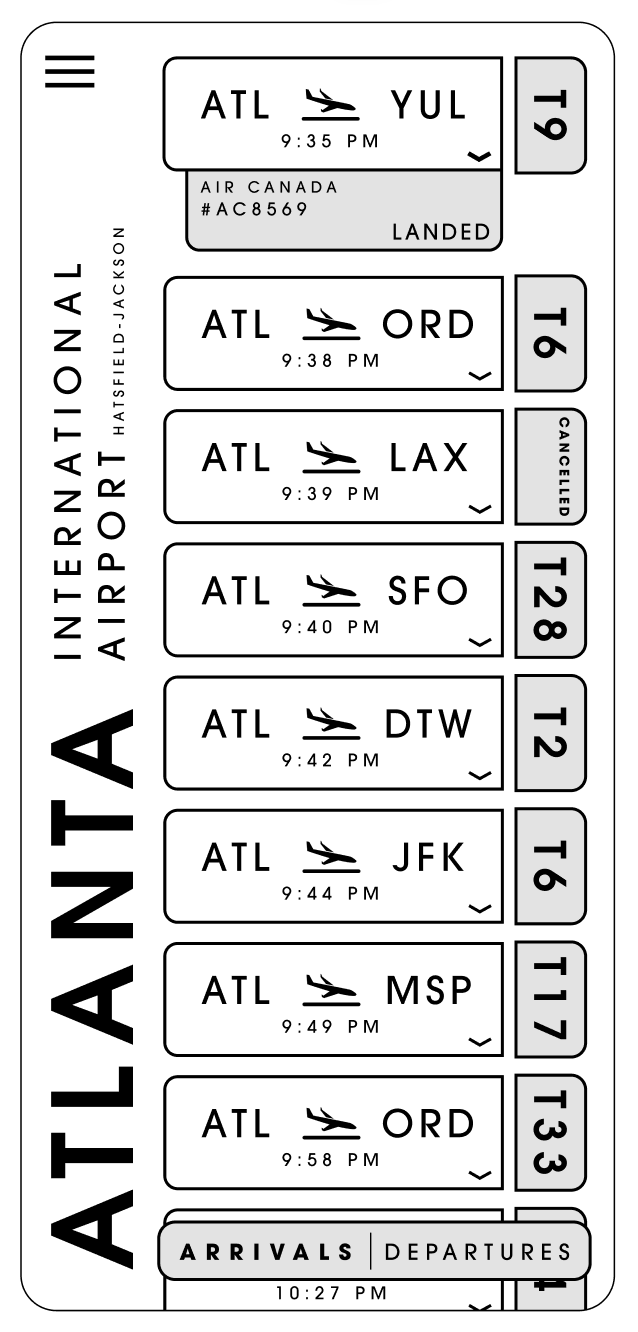
After looking through other airport apps, the next step was to sketch ideas to explore initial concepts before transitioning into digital. These sketches range from conventional to unconventional and help provide a clear foundation and direction for the next stages.
Digital Explorations
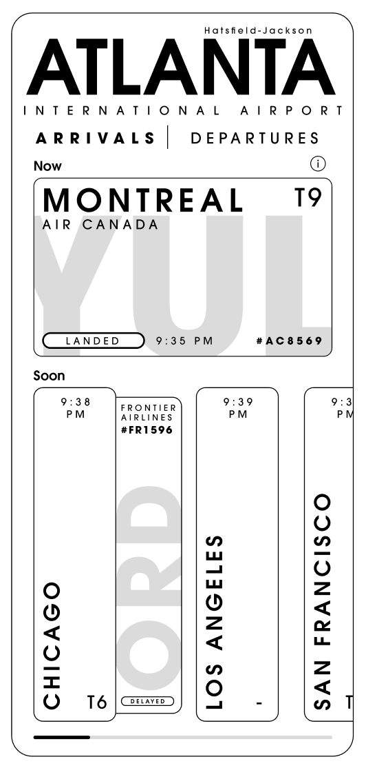
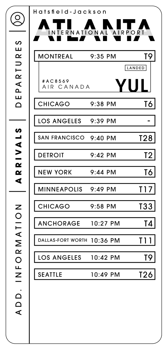
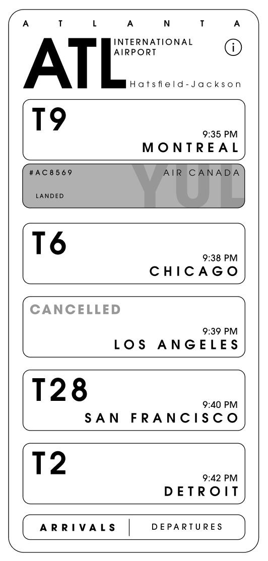
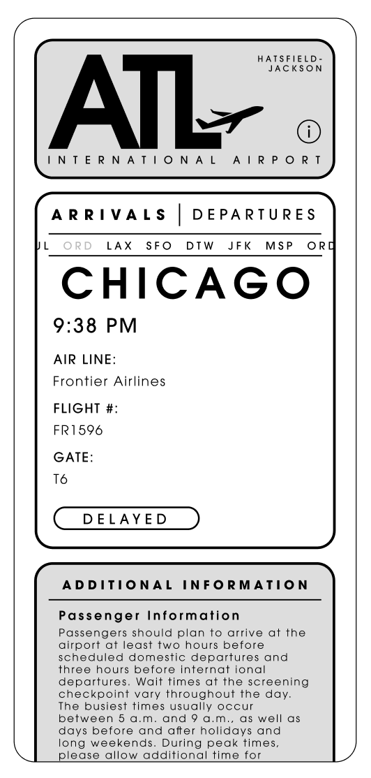
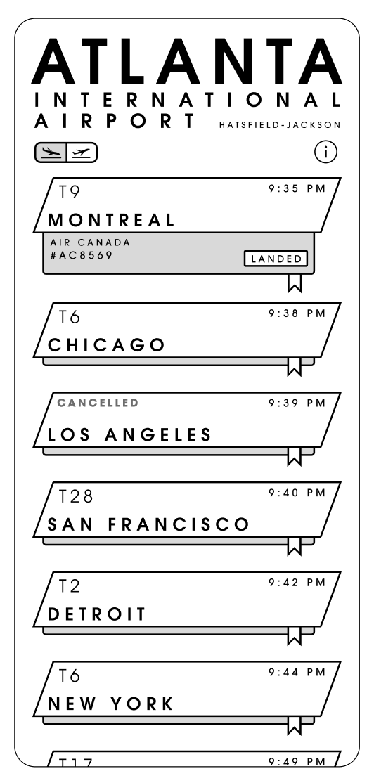
After sketching out all of my ideas on paper, I selected the strongest concepts and translated them into simple digital screens. This allowed me to further develop and refine the layouts, explore how the designs would function in a real interface, and make clearer decisions about structure and usability.
Typeface Studies
I chose ITC Avant Garde Gothic Pro because its clean, geometric style gives the app a modern and efficient feel, which fits well with an airline experience. It’s also easy to read on screens while still feeling distinctive. The typeface originally came from the Avant Garde magazine logo in the 1970s, designed by Herb Lubalin and Tom Carnase, and reflects a sense of forward-thinking design that connects well to the idea of travel and innovation.

Color Iteration
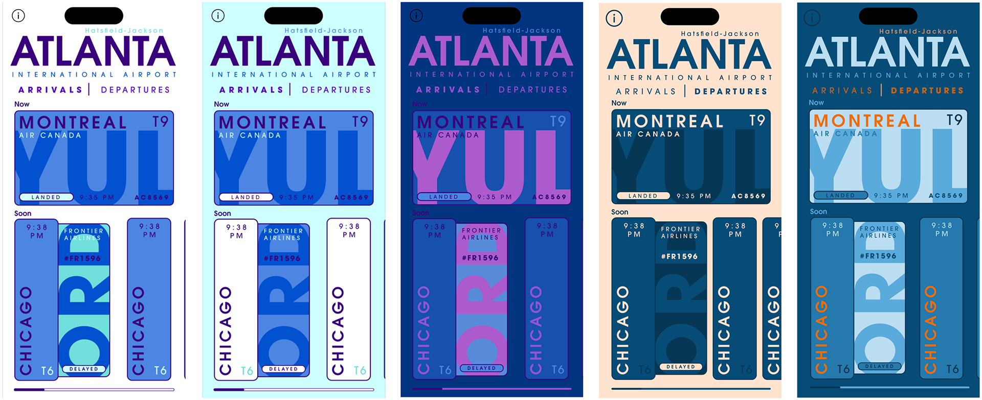
After choosing my strongest design, I experimented with different color harmonies to find what fit best. I ultimately chose blue as the primary color because it creates a sense of calm and reliability, which supports the overall feel of the app. I paired it with orange as an accent to add contrast and emphasize important information.
Final Design
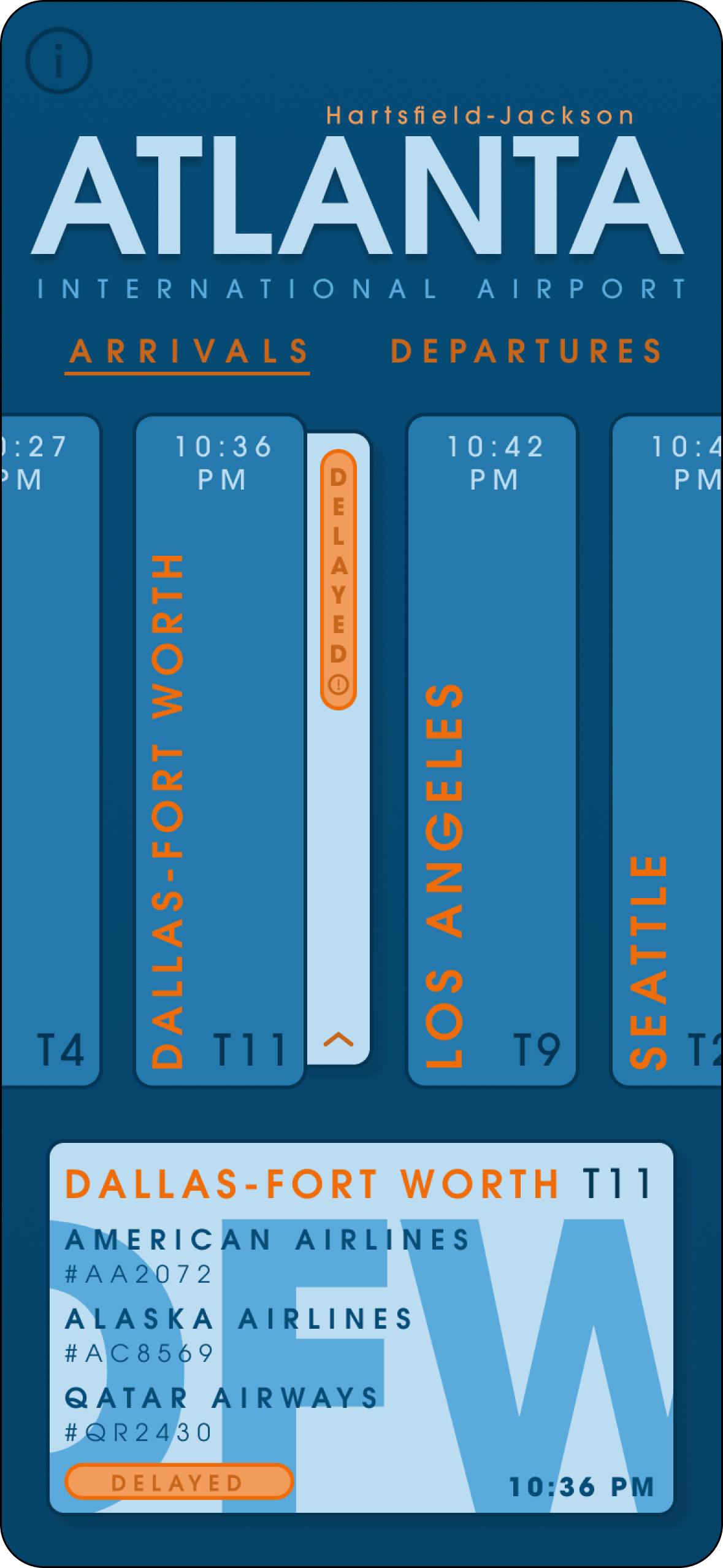
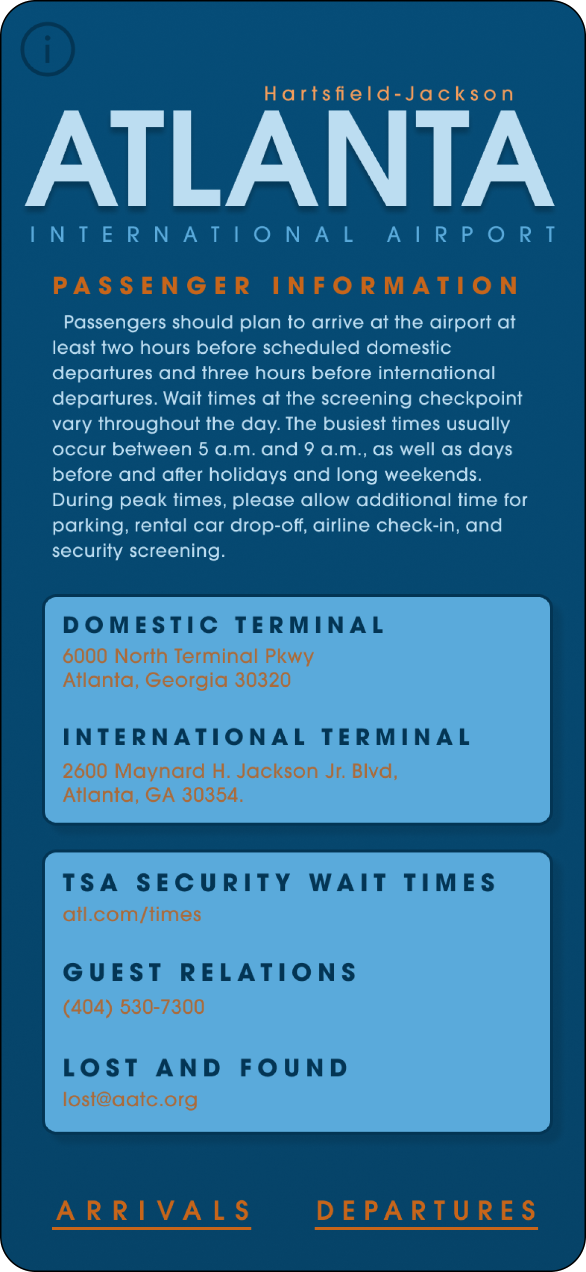
App Animation